Make Photo Pixel Art: Step-by-Step Guide with AI Prompts
ImagesArt.ai
11/14/2026
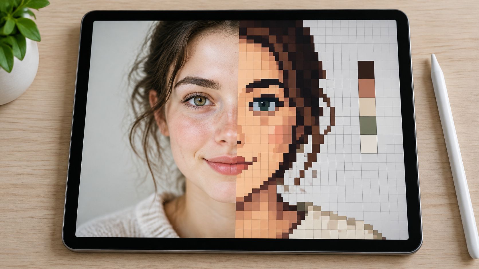
You've got a photo that already works. A portrait with clean window light, a product on a plain table, a dog that finally sat still for two seconds. You run it through a pixel-art filter, and what comes back is a tan smear with two dark holes where the eyes were.
The filter isn't broken. Making photo pixel art is a sampling problem. You're discarding nearly all the information in that photograph and betting that the few hundred pixels left still describe a face, a logo, or a shape someone recognizes. That's a design decision, and no slider makes it for you.
Many photographers are now handing this work to automation. A 2024 Zenfolio survey cited in a 2025 industry summary found that 32.2% of photographers used AI as a regular part of their workflow, while 53.1% used it as needed (summary of the Zenfolio survey). Convenience is exactly why so many conversions look careless. The method below fixes that, starting with the choice often left until last.
Table of Contents
- Choose a Grid Size and Palette Before You Upload
- How to Convert a Photo to Pixel Art Step by Step
- Prompts That Keep Faces and Products Readable
- Fix Palette, Outline and Noise When the Result Looks Off
- Export Pixel Art for Reels, Ads and Avatars
- Confirm Rights and Convert Your First Photo
Choose a Grid Size and Palette Before You Upload
The first number you commit to isn't the canvas size in your editor. It's how many pixels the subject itself gets. That single choice decides whether the person in the photo stays a person or turns into a stack of tan rectangles, and no palette work rescues a grid that was too small to begin with.
| Grid size | Best for | Colors to start with | Detail that must survive |
|---|---|---|---|
| 16×16 | Small icons and avatars seen at thumbnail size | 8 | Overall silhouette and two or three color zones |
| 32×32 | Simple product icons and character portraits | 8 to 16 | Eyes or product outline and the main light-shadow split |
| 64×64 | Recognizable faces and text-free logos | 16 | Facial landmarks and clear edges between regions |
| 512×512 | Profile images and small game-style icons | 12 to 16 | Subject outline and major tonal groups |
| 1024×1024 | Larger character images and reusable masters | 16 to 24 | Full subject with internal detail kept deliberate |
The rule underneath the table is short. The subject has to keep its silhouette at 1× and at thumbnail size. Palette count, dithering, and outline style are second-order decisions you can revise later. Silhouette is the one you can't fix in post.
It helps to remember what you're throwing away. The word "pixel" was first published in 1965 across two technical papers by Fred C. Billingsley of Caltech's Jet Propulsion Laboratory, and the meaning has held: a picture element is a single sample, so the pixel count is the sample count, which sets a hard ceiling on visible detail (the history of the pixel). A 16×16 canvas hands you 256 samples for an entire person. Spend them where recognition happens.
Run a ten-minute test before you invest in a full conversion. Pick one grid from the table. Convert the photo at that size with no cleanup at all. Look at the result at 1×, at 4×, and at the size it will appear in a feed. If the subject is still identifiable at thumbnail size, the grid is right. If it isn't, move up one size.
A photo's flaws travel with it. JPEG noise, shallow depth of field, and soft anti-aliased edges all become hard-edged artifacts once the image passes through a regular grid, and a blurred transition can only resolve to fully transparent or fully opaque (image-to-pixel conversion notes). Enlarging the output afterward doesn't bring back detail that was dropped.
Match the grid to viewing distance, not to the file you started with. An avatar that renders at 80 pixels on screen needs a fraction of the pixels a 1080-pixel feed post does, and extra pixels at that size are invisible. Crop square around the subject first, because a square master serves your profile image, thumbnail, and icon without recropping.
If the face or the product reads as a smudge at the size you planned for, go up one grid size. Adding colors to a collapsed silhouette only produces a more colorful smudge.
When the same piece is going to print, say a poster or a sticker sheet, the poster-size file prep guide for print shops covers the resampling and bleed steps a 1024-pixel PNG can't satisfy by itself.
How to Convert a Photo to Pixel Art Step by Step
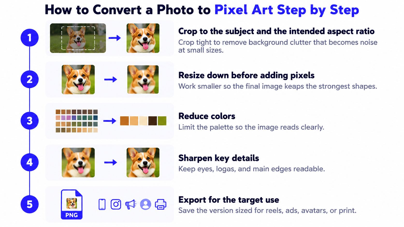
Six steps in this order take a photograph to a sprite you can publish. Each has a failure mode, and every failure mode looks the same on screen: a mushy subject.
Crop to the subject and the intended aspect ratio. Background clutter that reads as texture at full size turns into noise at 32×32, and every stray object competes with the silhouette. The usual slip is a loose crop made because the final shape hasn't been decided. Decide the shape, then crop to it.
Build the square master before you shrink anything. If the photo needs cleanup, a straighten, a plainer backdrop, or more even light, do that work at 1024 pixels or larger where edits are cheap and reversible. The Image to Image tool is a sensible place to restage a photo before conversion. Editing the tiny version means fighting pixels you can't even see.
Downsample with nearest-neighbor sampling. Nearest-neighbor selects an existing sample instead of averaging neighbors, so each color cell stays intact. Bilinear and bicubic filtering blend across edges and turn the eye line of a portrait into grey mush. This is the most common single reason a face vanishes.
Reduce to a fixed palette. A chosen palette keeps tone relationships stable from one export to the next. Let software decide and you get hundreds of near-identical browns doing the job of four. Introduce a color only when it marks a distinct material, a value step, or a focal detail, and leave dithering off on small subjects.
Clean the grid by hand. Repair silhouettes, stair-step diagonals, isolated stray pixels, and the two or three largest light-shadow clusters. Automatic conversion always leaves ambiguous regions where two similar colors merged. This step is where the artwork happens.
Export at native size and scale by whole numbers only. Going from 32×32 to 128×128 is clean. Going to 100×100, or applying a smoothing filter at export, produces uneven and muddy edges. Keep the 1× file as your master.
Why Two Steps Decide the Result
The workflow above matches a documented conversion sequence, and two details inside it deserve spelling out. Nearest-neighbor sampling preserves discrete color cells precisely because it picks an existing sample rather than averaging neighboring ones, and a workable starting range for a sprite or icon is 8 to 16 colors, with dithering reserved for broad, low-contrast gradients where it doesn't fight the silhouette (pixel art workflow notes). Broader scenes can carry more colors, but each addition should earn its place.
Practical rule: if you can't tell two regions apart in a grayscale version of the sprite, the color version is doing structural work that value should be doing.
Prompts That Keep Faces and Products Readable
A prompt does two jobs. It sets the style, and it withholds information you don't want. Weak pixel-art prompts do the first badly and skip the second entirely. Build yours from five parts, in this order.
- Subject and framing: who or what, from which angle, and how much of the body or object is in frame.
- Silhouette requirement: state it outright, because it's the property you'll judge the output on.
- Palette limit: name a number, 8 to 12, so the model can't hedge with gradients.
- Pixel style: hard square pixels, no smoothing, no gradients, no anti-aliasing.
- Background: solid color or transparent, so the subject edge stays legible.
Unity's documented sprite workflow covers the same list, noting that a prompt can specify "single subject, readable silhouette, limited color palette, hard square pixels, no gradients, centered composition, transparent or solid background," with reference sizes of 512×512 pixels for a small icon and 1024×1024 for a larger character image (Unity's sprite workflow guide). Explicit pixel-size and sampling controls matter because they let you choose between preserved detail and deliberate chunk, instead of leaving it to an unspecified filter.
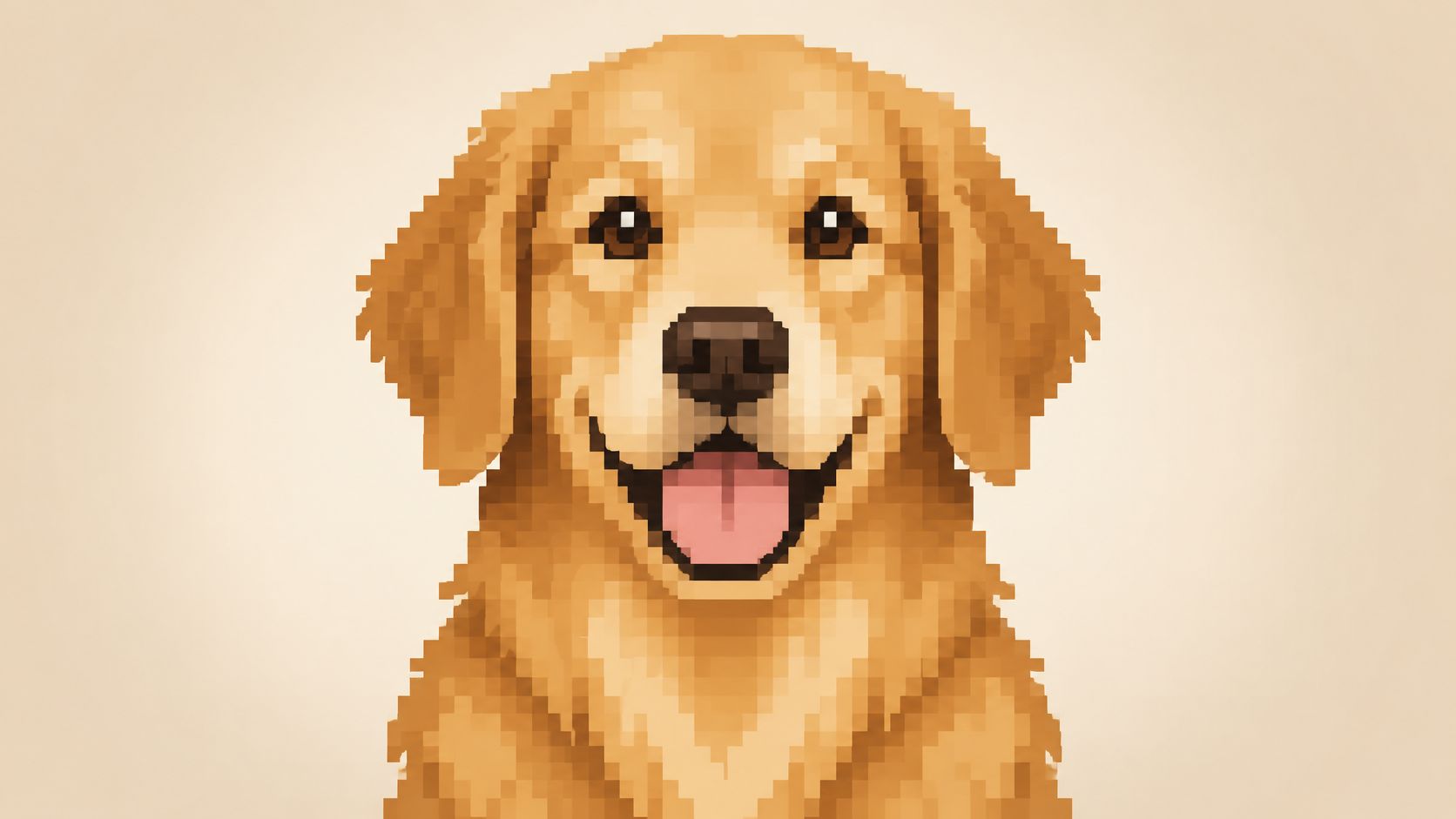
Two worked examples, both pasteable.
The street-food vendor. "Street-food vendor holding a tray of skewers, waist-up, afternoon light from the left, single subject, readable silhouette, limited 12-color palette, hard square pixels, no gradients, centered composition, solid dark background." The framing keeps hands and tray inside the grid, the light direction guarantees one clear shadow side, and the dark backdrop separates the silhouette. What it can't do is promise the skewers survive as skewers. At 32×32 that tray reads as a block, and you either accept the abstraction or reserve a few pixels for it during cleanup.
The ceramic mug. "Ceramic coffee mug, three-quarter angle on a plain table, single subject, readable silhouette, limited 12-color palette, hard square pixels, no soft shading, no motion blur, no text, centered composition, plain background." The three-quarter angle is deliberate, since it puts the handle on the silhouette where a straight-on shot loses it. What the prompt can't control is where the specular highlight lands. You'll place that pixel yourself. Product teams thinking about how generated imagery fits a catalogue will find useful context in how AI is changing product photography, particularly on when a stylized treatment beats a literal one.
The negative constraints are doing specific work: no soft shading blocks gradient falloff, no motion blur protects edges, no text stops the model inventing illegible lettering, and no photographic texture prevents grain that turns into confetti after quantization.
Run the same photo through two prompt versions and compare at thumbnail size, not at full zoom. Upload the original as a reference image so proportions and features carry through, then generate both versions on different models when you have more than one available. Ask for a square frame at 512×512 or 1024×1024 so the output matches your master sizes. Check what a batch will cost in credits before you queue twenty images, and always test one photo first. The general ordering logic transfers across generators, and how to write Midjourney prompts explains why early terms carry more weight than late ones. A prompt is a starting position, never a guarantee.
Fix Palette, Outline and Noise When the Result Looks Off
When a conversion looks off, resist tuning colors first. Check whether the subject still reads at 1× zoom and at feed size. Palette problems are loud; readability problems are fatal.
| Symptom | Likely cause | Fix |
|---|---|---|
| Subject unreadable at 1× zoom | Grid too small or too much internal detail | Move up one grid size or simplify interior shapes |
| Speckled noise across flat areas | Dithering on a small subject or stray colors | Remove dithering and keep the palette at 8 to 16 colors |
| Face or product edges blurred | Bilinear or bicubic downsampling | Re-run with nearest-neighbor sampling |
| Features vanish in grayscale | Palette colors with similar lightness | Add luminance steps between adjacent regions |
| Uneven, jagged pixel edges after export | Non-integer scaling | Scale only by integer multiples |
| Silhouette collapses at thumbnail size | Too many small interior clusters | Clean the silhouette and merge small clusters |
Two fixes get reached for first, and the order matters. When edges go soft, the grid size is rarely the culprit; smoothing during downsampling is, so re-run the resize with nearest-neighbor sampling before you change anything else. If flat areas look speckled instead, dithering is probably fighting the silhouette on a subject too small to carry it. Remove it, then count your colors.
The Accessibility Check Most Tutorials Skip
Shrinking to a small palette raises the stakes on luminance contrast and color separation, because you have far fewer chances to differentiate two regions. Work on generated imagery reports that diffusion models do not reliably satisfy accessibility-focused prompts, since they were not trained for those constraints (accessibility research on generated imagery). The reliable checks are mundane: view the sprite in grayscale, avoid red-green pairings, keep adjacent regions separated by lightness rather than hue alone, and add shape or texture cues where meaning matters.
Three checks catch most problems. View the sprite in grayscale and confirm the subject still separates from its background. Check that every pair of adjacent regions differs in lightness, not just hue. For anything carrying meaning, such as a status, a variant, or an identity marker, add a shape or texture cue as a second channel.
Test at display size. A palette that passes on your monitor at 400% zoom can still fail on a phone at 80 pixels in a feed.
Typing "use an accessible palette" into a prompt does not validate the output. Detection requires measurement and a human review of the actual size. Flat or washed-out color originals typically need contrast restored in the photo before quantizing. A monochrome source is different: if hue is needed to separate regions, run a colorization pass such as AI colorize photo before you quantize, then re-check grayscale to ensure the added color did not collapse the luminance steps.
Export Pixel Art for Reels, Ads and Avatars
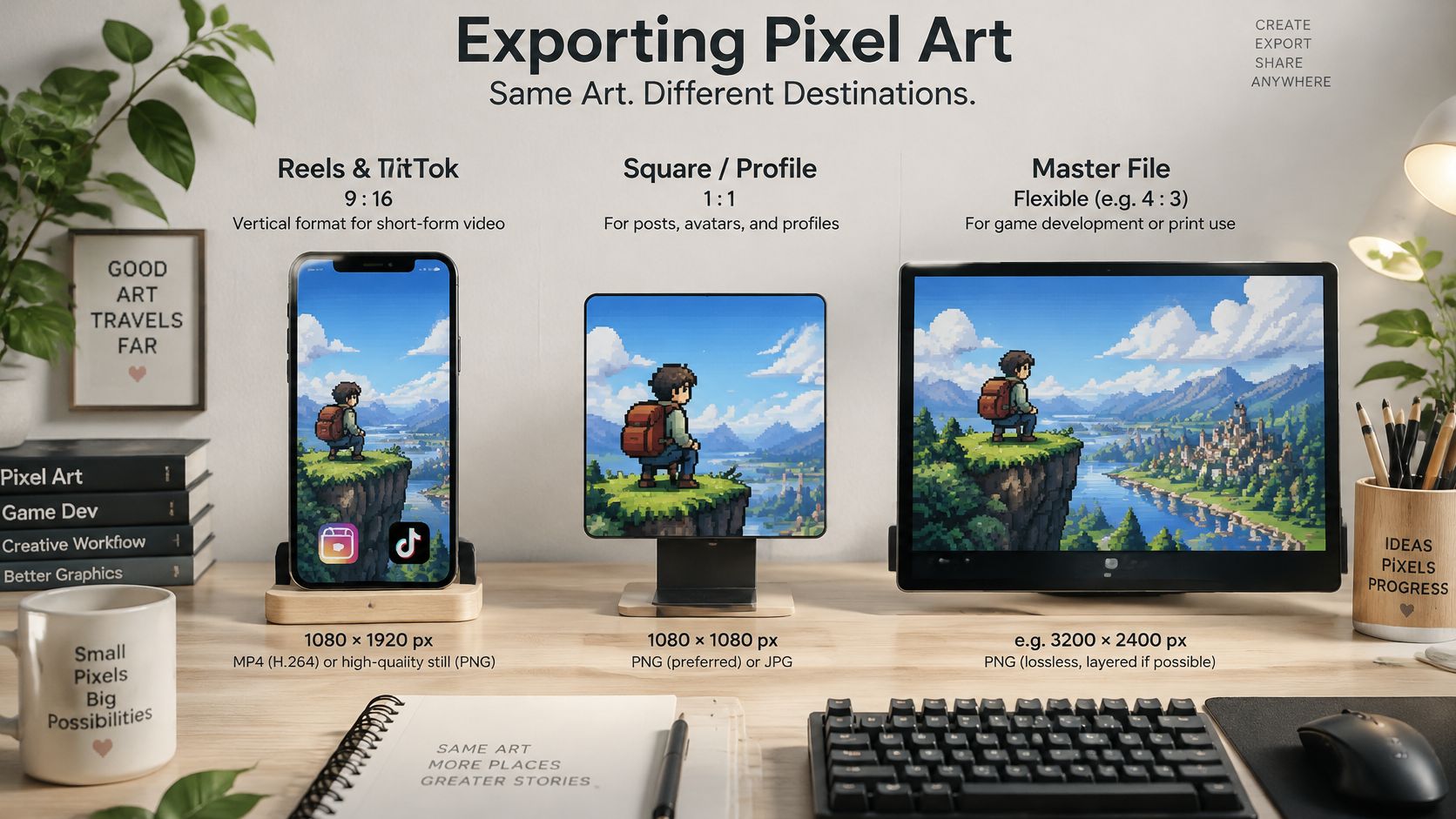
Three destinations cover most small-team work: vertical video, a square profile image, and a master you'll reuse for months.
| Use | Dimensions | Format | Note |
|---|---|---|---|
| Vertical Reels, TikTok or Shorts | 1080×1920 (9:16) | MP4, H.264 video, AAC audio | Keep names and calls to action out of the top and bottom edges |
| Square avatar or profile image | 512×512 | PNG | Export at native size and scale only by integer multiples |
| Game-style or larger character master | 1024×1024 | PNG | Unity reference size for a larger character image |
For short-form video, the safest general canvas is 1080×1920 pixels at 9:16, exported as MP4 with H.264 video and AAC audio (social video specs guide). Platform ceilings differ widely, with Instagram Reels supporting videos up to 20 minutes, TikTok listing uploads up to 60 minutes, and YouTube Shorts listed at up to 3 minutes. None of those limits should shape a pixel-art piece. A 6 to 15 second cut is easier to review, easier to repurpose, and comfortably inside every ceiling.
The reveal sequence that works most reliably:
- Finish the artwork at a square master size, at native pixel dimensions.
- Place that master inside the 1080×1920 composition with room around it.
- Animate a slow zoom or pan, keeping the pixel edges on whole-pixel positions so they stay crisp.
- Show the original photograph for a fraction of a second, then transition to the pixel version.
- Add a short text hook in the central safe area, away from the top and bottom where app interfaces and ad overlays land.
Watching the transition in motion is easier than reading about it.
Before you hand anything off, run three checks: confirm the export is at native size with no resampling applied, preview the vertical cut on an actual phone rather than a desktop monitor, and keep a larger preview alongside the master for the client or the team.
Confirm Rights and Convert Your First Photo
The rights question usually arrives after publishing, which is the wrong order. In the United States, an AI-assisted pixel piece isn't automatically protected. The U.S. Copyright Office states that when an AI system determines the expressive elements of an output, that material isn't the product of human authorship, though the work can still contain protectable human contributions such as sufficiently creative arrangement, selection, or modification (Copyright Office AI policy guidance). Applicants registering a work must disclose AI-generated material and exclude more-than-de-minimis AI content from the claim.
Prompts alone may not demonstrate enough human control to establish authorship, so a heavily edited or composited piece is easier to document than an untouched generation. Build the record as you go.
- Keep the source: the original photo plus whatever permission covers it.
- Keep the process: the prompt, every edit, the compositing steps, and the final export.
- Keep the human layer: palette design, layout, retouching, typography, frame-by-frame corrections.
- Label the AI portions: a short note on which elements came from a model saves an argument later.
If the pixel art is heading for apparel or merchandise, AI apparel design basics covers the file and print considerations that sit downstream of the artwork itself.
Before you publish, confirm consent for any identifiable person in the photo. A recognizable likeness can need a signed release even when you took the shot yourself, so store the release next to the source files and the export.
ImagesArt AI creates videos and images from text or photos, with Seedance, Kling, Veo and other models available in one account. Its Text/Image to Video mode animates a single uploaded photo and handles camera movement and native sound, which is enough to build a short reveal clip from one still. New accounts start with 15 free credits, so a first test costs nothing.
Then take the first action today: pick a grid size from the table, run the six steps on one photo, and judge the result at 1×, 4×, and thumbnail size before you convert anything else.
Pixel art that moves gets more attention than pixel art that sits still, and ImagesArt AI lets you animate one converted photo into a short clip with camera movement and native audio, using Seedance, Kling, Veo and other models inside a single account. Start with the free 15 credits, generate a couple of takes, and compare them at the size your audience will see. Visit ImagesArt AI to turn your first photo into a reveal video worth posting.