8 Home Staging Ideas Pictures for Listings in 2026
ImagesArt.ai
11/13/2026

Your listing goes live Thursday. The wide shot of the living room is technically fine. Level horizon, decent light, one lamp glowing in the corner. It also looks exactly like the eleven other listings a buyer scrolled through on the train this morning, which is the actual problem.
Buyers' agents are direct about what decides the click. In the National Association of REALTORS® 2025 Profile of Home Staging, 73% said listing photos were highly important to their clients, ahead of videos at 48% and virtual tours at 43%, and 31% said clients were more willing to walk through a home after seeing it online when the property was staged (NAR 2025 staging report).
Treat each frame as a small sales document. It has to answer three questions in under two seconds: how big is this room, how does it work as a space, and whether a buyer can picture ordinary life happening inside it. The physical prep order matters too, and Miller Waldrop's staging advice for realtors walks through the sequence well.
The eight ideas below are built for pictures rather than showings alone. Each one pairs a physical move with a picture-making workflow, so a single setup can produce stills, a short clip, or both.
Table of Contents
- 1. Neutral Base Palette with Warm Greige Walls
- 2. Decluttering and Depersonalizing
- 3. Furniture Scaling and Room Zoning
- 4. Layered Lighting for Listing Photos and Showings
- 5. Curb Appeal and Exterior Staging
- 6. Virtual Staging for Empty Rooms
- 7. Accent Vignettes and Styled Surfaces
- 8. Buyer-Persona Staging with Lifestyle Scenes
- How the eight home staging approaches compare
- Turn Your Staging Pictures Into a Repeatable Listing Plan
1. Neutral Base Palette with Warm Greige Walls
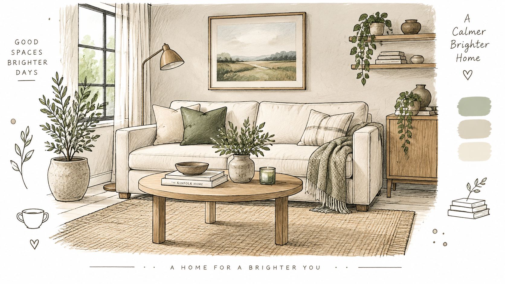
Soft white, warm greige, and light taupe on the walls do more for a listing photo than most furniture choices. Neutral walls let the eye read the room's real dimensions, because light reflects evenly instead of pooling under a saturated color. Buyers stop noticing the owner's taste and start measuring the window.
Two setups carry most of the work. An off-white living room with a cream sofa, oatmeal throw pillows, and a jute rug reads calm and bright. A bedroom with greige walls, linen bedding, and one sage-green accent chair gives the gallery a second look without introducing a second palette.
Three textures, minimum
A neutral room goes flat when every surface is the same material. Layer at least three textures (wood, linen, metal) and keep them close enough that one camera frame catches all three. A pale room with a jute rug, an oak table, and a matte black lamp base reads warm. The same room in all-white upholstery and drywall reads like a rental.
Test paint on two walls, not one. Color shifts with the light. Check the sample in morning and evening before committing, and buy a full gallon rather than spot-touching patches later.
Preview the wall color on a photo first. Shoot the room in daylight, then run it through an AI image editor such as ImagesArt with a prompt like "same room, walls in warm greige, cream linen sofa, oatmeal pillows, jute rug, oak coffee table, eye-level wide shot, soft daylight, no people." Generate two or three palette variations and compare them side by side before a brush touches the wall.
One limit. If the paint is flaking or the drywall is patched badly, fix it physically. High-resolution photos expose texture, and no edit fixes bad prep. On a dated property it's often smarter to skip painting a dated fixer-upper and price for it than to paint over a failing surface.
2. Decluttering and Depersonalizing
Nothing in a staging budget returns as quickly as subtraction. Clear the counters, shelves, fridge door, and family photos, and every room in the gallery gets bigger. Buyers need to see storage and square footage they can use, not the evidence of someone else's routine.
The 2025 NAR survey makes the case for doing this first. 83% of buyers' agents said staging made it easier for buyers to imagine the property as their future home (2025 Profile of Home Staging). A counter packed with appliances and a hallway of school portraits work against exactly that.
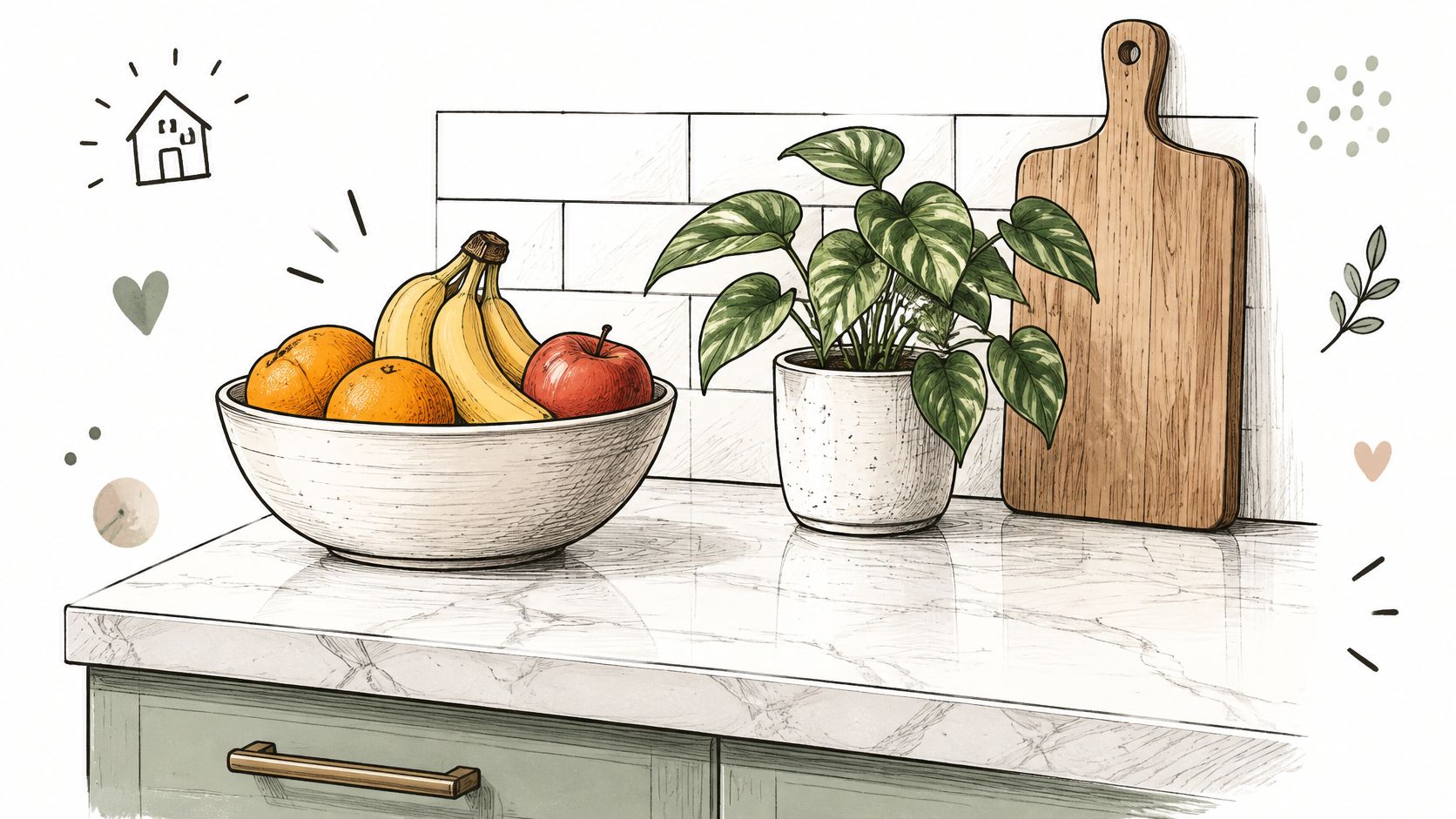
Stage the counter with one fruit bowl, a small plant, and a cutting board. Stage the bathroom with folded white towels, a single soap dispenser, and an empty vanity. Three objects per surface signals a lived-in home instead of an abandoned one.
Turn the before and after into one clip
Start-End Frame generation takes two supplied photos and builds the transition between them. Feed it the cluttered kitchen and the cleared kitchen shot from the same tripod position, and you get a clean wipe for a Reels post or a client pitch deck. Match camera height in both frames or the transition jumps at the cut.
- The one-year rule: anything unused in twelve months goes into a box and out of frame.
- Closets count: hang fewer items and leave visible air between hangers, since buyers open doors.
- Shoot the pair: before and after from the same spot, same lens, same time of day.
- File the reference: keep the cleared photo with the listing address so the next property in a similar style has a target to match.
3. Furniture Scaling and Room Zoning
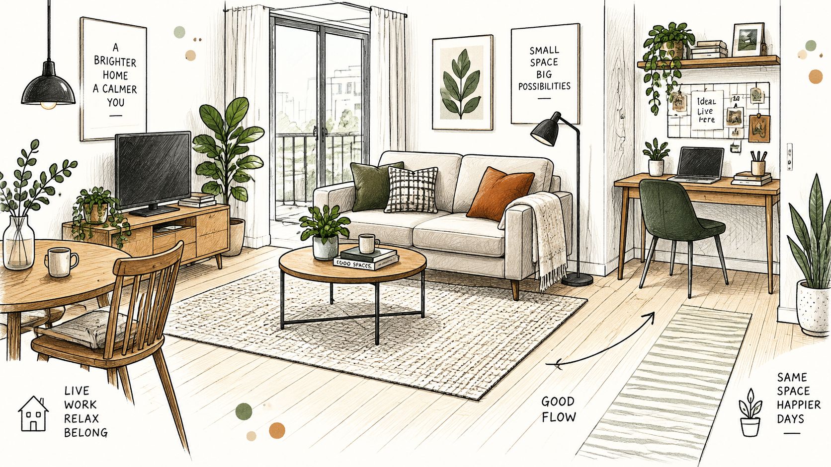
A sofa two feet too long ruins a photo faster than bad paint. It swallows the walking path, crowds the window, and makes a decent room look tight. Scale is the quiet variable: pieces that fit the dimensions leave clear circulation, and zones give buyers a story about how the square footage works.
Spend your effort where buyers look. NAR's 2023 survey found buyers' agents ranked the living room as the most important room to stage at 39%, the primary bedroom at 36%, and the kitchen at 30% (2023 Profile of Home Staging). The same report found 20% of buyers' agents believed staging raised the offer by 1% to 5% over comparable unstaged homes. That's an agent-reported association, not a guaranteed return, so keep the styling credible and market-neutral rather than loading the room with luxury props.
Measure, draw, then move anything
Draw a scaled floor plan before furniture moves. Mark door swings and traffic paths, then place the rug first, since it defines the zone. Keep the front legs of chairs and sofas on the rug edge so the seating group reads as one unit. In an open plan, one rug for the sofa area and a small desk in a corner does more than a wall ever will.
Reference mode accepts up to seven images of your actual furniture and room, which keeps a layout consistent across every generated view. Build several layouts from the same reference set and compare them in one workspace before anyone lifts a sofa.
Here's the layout change in motion, which explains a zoning fix faster than a paragraph can.
4. Layered Lighting for Listing Photos and Showings
One overhead fixture is a photo killer. It throws hard shadows under cabinets, flat light on the ceiling, and a hot spot on whatever sits directly below it. Layered lighting fixes the frame and the showing: ambient light for the room, task light where people work, and accent light to pull a dark corner forward.
A living room with two table lamps and a floor lamp balances the corners a ceiling fixture forgets. A kitchen with under-cabinet LEDs plus pendants over the island gives the camera something to read at both heights. Both setups photograph warmer and wider than the same rooms lit from above alone.
Two rooms shot at different color temperatures look like two different houses in the same gallery.
Match the bulbs. Replace mixed bulbs with one warm white type, somewhere around 2700K to 3000K, across the visible fixtures in a room. Then set white balance once on site and apply it to the whole set rather than correcting each file by eye.
Shoot the light at three times. Morning, mid-afternoon, and dusk give three different moods from one room. On a west-facing living room, the late session usually wins, because the glare is gone and the walls hold their color.
For presentations, Start-End Frame generation shows a dim room transitioning into the lit version, which is a persuasive way to pitch a lighting upgrade to a seller who thinks lamps are decoration. Shoot the room from the same tripod position twice, lights off and lights on, then build the transition.
5. Curb Appeal and Exterior Staging
Most buyers meet the property from the street, through a thumbnail. The front entry, walkway, landscaping, and door color set an expectation before anyone sees the kitchen. Small exterior fixes move that expectation further than most sellers believe.
A front porch with two potted plants, a neutral doormat, and a freshly painted black door reads cared-for. A backyard with a small dining set, string lights, and a swept patio reads usable. Both cost a weekend and photograph like a different property.
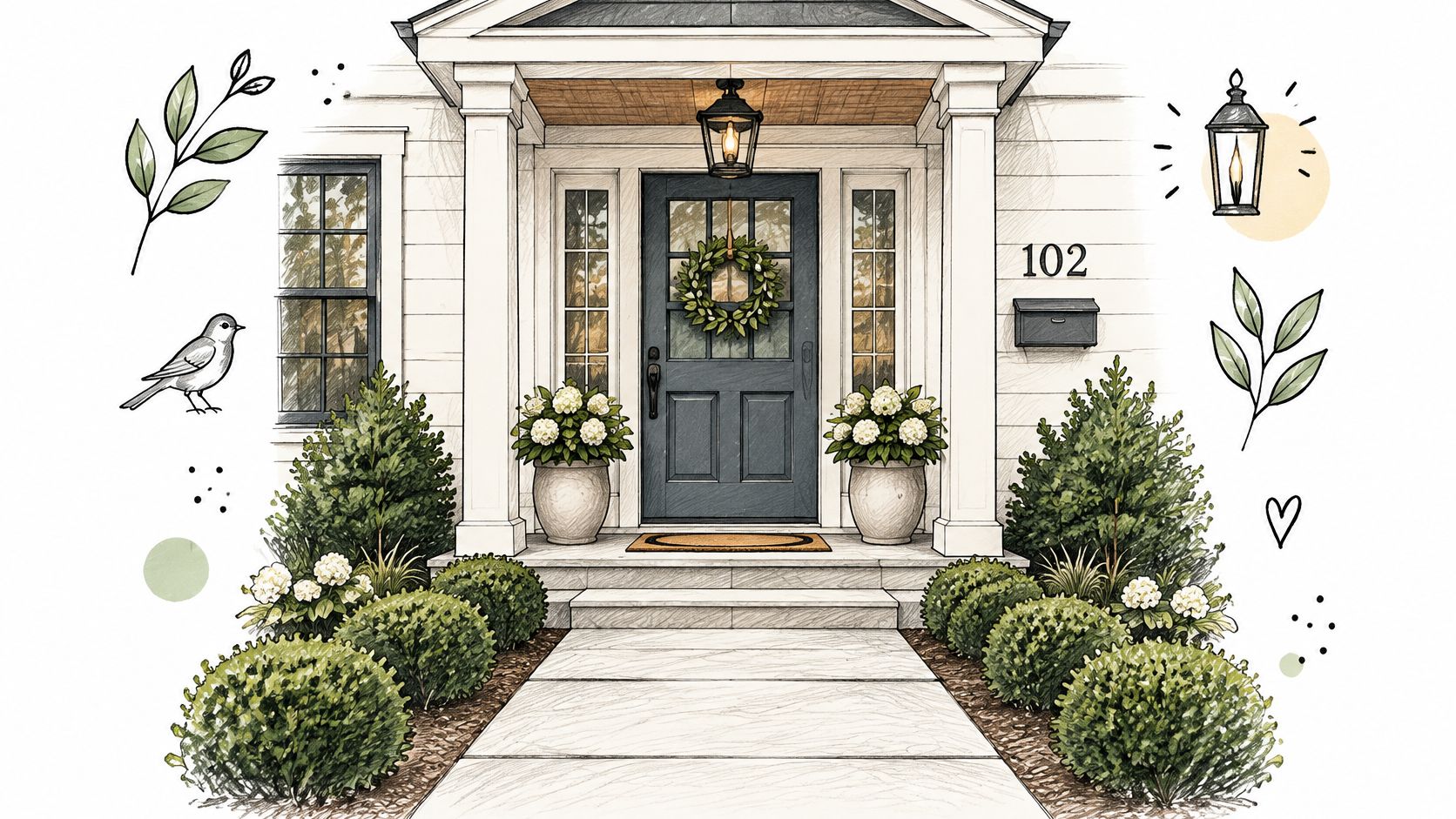
Walk the property from the street and note the first five things a buyer sees. Fix those, then repeat from the front door. Fresh mulch, trimmed hedges, clean glass, and a working porch light cover most of the list.
One or two seasonal plants beat ten decorations. A pair of matching pots frames a door. A cluster of small ornaments reads as clutter in a thumbnail, where the detail disappears anyway.
Shoot a drive-up clip. A short walkthrough from the sidewalk to the front door works well for listing promotion and social posts. Render at 1080p for standard use, and check your plan's resolution access before generating exports at 4K, since higher resolution tiers offer higher output settings.
6. Virtual Staging for Empty Rooms
A vacant living room can look smaller in a listing photo because buyers have no furniture to judge its scale. Virtual staging adds digital furnishings to a photo of the empty space. It can suit a vacant property or a budget that does not allow for physical staging. For a fuller explanation, see this guide to how virtual staging works.
The National Association of REALTORS® 2025 profile reported the living room as the most frequently staged space at 91%, followed by the dining room at 69%. Use those rooms as a starting point when choosing where to create digital mockups.
Label every staged image. State in the caption and listing remarks that the room has been digitally furnished. Buyers should know what to expect before they arrive.
One base photo, three style options
Start with a clear, well-lit photo of the empty room. Keep the camera level and leave enough space around the walls and floor for furniture to fit naturally. Create two or three variations, such as modern, traditional, and coastal, then compare them against the home's architecture. Keep the original photo in the gallery so buyers can see the unaltered room.
For a short listing clip, use the empty photo as the opening frame and a staged version as the end frame. The transition can show the proposed layout while keeping the room's actual shape visible. Check that furniture scale and placement make sense before sharing the clip.
7. Accent Vignettes and Styled Surfaces
A bare coffee table can make a finished living room feel cold in a listing photo. Give the camera one clear focal point: a tray, two stacked books, and a small vase. Keep the arrangement low enough to preserve sightlines across the room.
Build a vignette with three objects at different heights and textures. On a console, pair a taller ceramic vase with a framed print and a small bowl. On a shelf, vary books with one framed image and a plant. Start with the largest piece, add the smaller items, then remove anything that competes for attention.
Repeat one accent color in two or three places. A sage cushion, book spine, and ceramic piece can connect the table to the rest of the room without making the palette feel busy. For more styling advice for Bay Area living rooms, use the coffee table as the starting point.
Reference-based mockups can help you plan the picture before you arrange the objects. ImagesArt AI Reference mode accepts up to seven uploaded images of people, products, or places and combines them into one scene. For a styled surface, use photos of the decor pieces you want to include, then prompt for their placement, scale, and the room's existing style. See this guide to turning a reference into an image.
A quick mockup can test whether a lamp, plant, or tray feels balanced in the frame. Check the result against the actual room before moving anything. The mockup helps plan the composition; the listing photo should show the finished space accurately.
Practical rule: Keep the surface to three objects in the final photo. If every item draws the eye, remove one.
8. Buyer-Persona Staging with Lifestyle Scenes
Generic staging photographs well and sells nothing in particular. Persona staging picks one or two likely buyers, a remote worker, a young family, a downsizing couple, and dresses each room as that person uses it. The photo then does the imagining for the buyer.
A spare bedroom becomes a home office with a desk, an ergonomic chair, and a bookshelf at the camera's left. A sunroom becomes a reading nook with a lounge chair, a throw blanket, and a side table holding one book. Neither costs much, and both give the gallery a story.
The payoff shows up in how fast properties move. In 2025, 49% of sellers' agents reported that staging reduced the time a home spent on the market (Florida Realtors summary of NAR data).
The ten-second clip that shows the room in use
A still proves a room exists. A short clip proves how it lives. Use Text-to-Video to build a ten-second lifestyle shot, someone settling into the reading chair, or a slow push across the desk toward the window, and cut it vertical for Reels and Shorts.
- Set length first: clips run from 1 to 15 seconds depending on the model, and a ten-second cut fits most social slots.
- Match the frame: vertical 9:16 for Reels and Shorts, 16:9 for a listing page or a paid ad placement.
- Check the cost before you generate: the button shows the credit cost, which depends on model, resolution, and duration.
- Plan the ad version too: the same room-in-use footage works as a paid social spot, which is what this guide to AI video advertising covers in more depth.
How the eight home staging approaches compare
| Item | Best for | Typical cost | Main effort | Best picture format |
|---|---|---|---|---|
| Neutral Base Palette with Warm Greige Walls | Broad buyer appeal and brighter listing photos | Low to moderate; repainting may add cost | Choosing consistent paint tones and adding texture | AI-generated image |
| Decluttering and Depersonalizing | Making rooms feel larger and more buyer-friendly | Low | Sorting, storing, and clearing surfaces | Checklist infographic |
| Furniture Scaling and Room Zoning | Showing practical layouts and defining open-plan areas | Low to moderate; furniture rental may add cost | Measuring rooms and planning furniture placement | Process-flow infographic |
| Layered Lighting for Listing Photos and Showings | Warmer rooms and more appealing photos | Relatively low | Matching bulb temperatures and balancing light | AI-generated image |
| Curb Appeal and Exterior Staging | Improving the first impression from the street | Low for simple updates; higher for major repairs | Tidying landscaping and refreshing the entry | AI-generated image |
| Virtual Staging for Empty Rooms | Furnishing vacant rooms without physical staging | Lower than physical staging | Editing photos and clearly labeling staged images | Pros-and-cons infographic |
| Accent Vignettes and Styled Surfaces | Adding warmth and focal points without major changes | Low | Arranging a few coordinated decor items | AI-generated image |
| Buyer-Persona Staging with Lifestyle Scenes | Showing how rooms support likely buyers' lifestyles | Low to moderate; props may add cost | Researching buyer profiles and styling scenes | AI-generated image |
Turn Your Staging Pictures Into a Repeatable Listing Plan
A room can look convincing in person and still photograph poorly. Start with one room. Take a photo before making changes, then repeat the shot from the same position after each adjustment. Comparing the frames makes it easier to see which choices read clearly on camera.
For each room, capture a wide, eye-level view, a tighter lifestyle frame, a detail shot, and a short clip. Keep the camera position consistent when comparing layouts. These views give a listing gallery variety while showing the room's layout, atmosphere, and details.
Save cleared room photos, palette prompts, and furniture references in one folder for each property. For a vacant room, ImagesArt AI's Virtual Staging AI can create a furnished version. Reference mode accepts up to seven images of people, products, or places to guide a combined scene. Start with a 360p draft to check composition, then choose a higher resolution if the layout works.
A caution for this workflow. Generated furniture can make a room look larger or more polished than it is. Keep furniture scale plausible and leave windows and doorways clear. Show the original photo alongside the virtually staged image so buyers can compare the proposed look with the room they will visit.
New accounts receive 15 free credits without providing a credit card. Use a room photo to test a staging direction, then compare the result with the original. ImagesArt AI also supports image-to-video generation, so a staged still can become a short clip for a listing or presentation.
Staging photos and clips can share the same visual reference. A prompt can set the room's style, a reference-based mockup can guide the furniture and decor, and start-and-end frames can show a change from an empty room to a furnished one. Try one room at ImagesArt AI, then use the clearest result to shape the rest of the listing.