AI Style Transfer: How It Works and How to Use It
ImagesArt.ai
11/18/2026
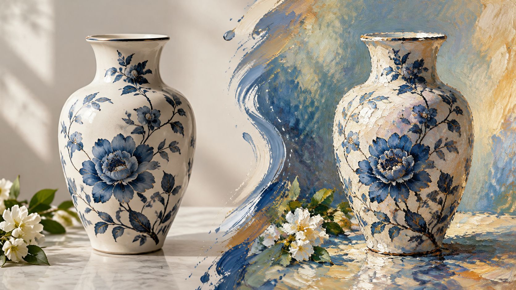
You've got a clean product photo that looks right in the catalog and flat in a Reel. The bottle is sharp, the background is gray, and the campaign needs a hand-painted surface by tomorrow. You don't want a reshoot. You want the same bottle, in the same place, wearing a different look.
That's what AI style transfer is for. One image holds the subject still. Another image supplies color, texture, and brushwork. The useful skill isn't picking a prettier filter. It's deciding what may change, what must stay fixed, and whether the file is safe to publish.
Table of Contents
- What AI Style Transfer Does to an Image
- Two Ways Style Transfer Gets Computed
- Strength and Prompt Settings That Steer the Result
- Run a Style Transfer and Test One Image First
- Quality Checks Before You Publish
- Creative Uses for Reels, Ads and Product Demos
- Using Artist Styles Without Crossing the Line
What AI Style Transfer Does to an Image
AI style transfer works like a dubbing job for a photograph: the performer stays in place, the voice changes. One input is the content image, which supplies subject, layout, edges and object shapes. The other is the style image, which supplies color relationships, texture and mark making. The output keeps the first image's structure and borrows the second image's surface.
The useful mental model is a painter hired under strict instructions. Repaint this scene in that manner, and leave every object where it is. The painter may roughen a white sweep into chalky blue strokes. The painter may not slide the bottle, rewrite the label, or add a product that was never there.
That is why content and style stay separate controls. Content answers, "Where is everything?" Style answers, "What does the surface feel like?" If you only name the mood, the model has to guess which parts are fixed, and product labels are usually where the guess shows first.
That split became a computer-vision milestone in August 2015, when Leon Gatys, Alexander Ecker, and Matthias Bethge introduced A Neural Algorithm of Artistic Style. Their method treated content as objects and spatial arrangement, style as correlations among feature maps, then optimized a new image to keep one photo's content while matching a painting's style statistics. Early iterative runs were slow, so later tools mattered less for novelty than for batch speed. If a still is only the first frame of a motion test, judge the clip stage separately, including measuring ROI from AI-generated video, instead of expecting the styled frame to prove the whole campaign.
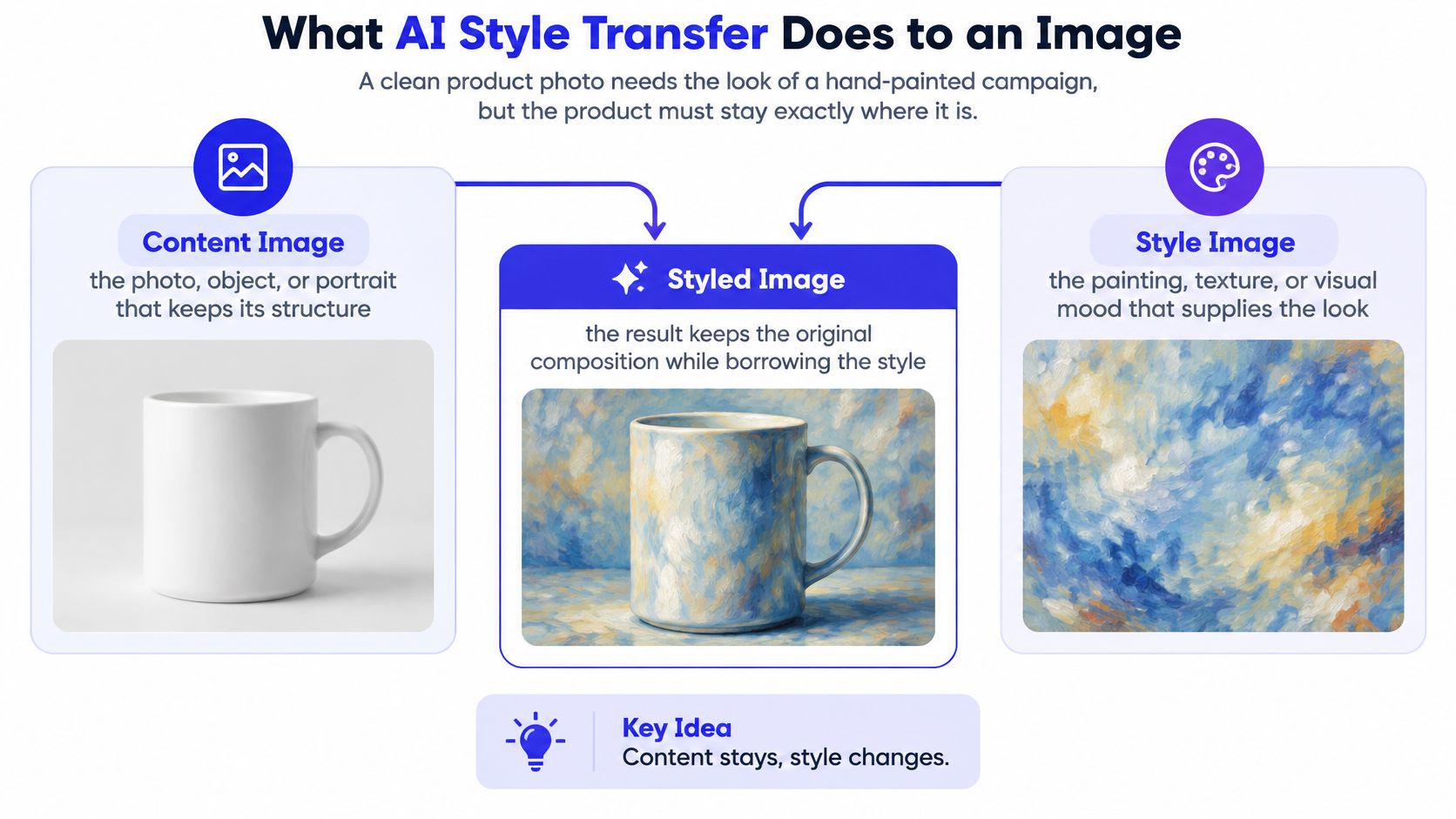
Write one sentence before you generate. Name what changes, such as color and brushwork, and what stays fixed, such as product shape, logo, and layout.
If you can't name both, run a small fix: lower style influence, restate the label as fixed, and regenerate one image before touching the set.
Two Ways Style Transfer Gets Computed
Consumer apps hide the math. The method still decides whether you're tuning one hero frame or styling a whole set of thumbnails. Three approaches cover almost every tool you'll meet.
| Method | How it works | Speed | Best fit |
|---|---|---|---|
| Iterative optimization (2015 method) | Repeatedly updates one output image to reduce content and style loss | Several minutes per photograph in early descriptions | One hero image that needs careful tuning |
| Feed-forward network | A trained transformation network applies a style in a single forward pass | Fast enough for batches | Many product photos or social thumbnails in one look |
| Adaptive Instance Normalization (AdaIN) | Aligns channel-wise mean and variance of content features to the style features | Fast, with no per-image optimization | Quick style previews and image-to-image tools |
Under the hood, the computer isn't comparing raw pixels. A survey of neural style transfer describes a typical objective as two scores added together. Content loss, often read from VGG feature activations, asks whether the subject and layout survived. Style loss asks whether feature statistics match, commonly through Gram-matrix correlations, which summarize how feature channels vary together. Perceptual, CLIP, or LPIPS distances can stand in when you care more about whether a person still recognizes the object.
The weight you actually move
Raise the style weight and color and texture lock on harder. Structural fidelity usually drops. Raise the content weight and geometry stays put, while the transformation gets weaker. That is the only trade-off you need to act on. You aren't hunting a perfect number. You're picking which failure you can live with.
AdaIN skips the slow loop. It aligns the channel-wise mean and variance of the content features with those of the style features, so a preview doesn't wait on per-image optimization. That speed is why image-to-image tools can show you a look before you've committed a batch. You still have to look for bent edges, lost product details, and texture that lands on the bottle but not the background.
Use iteration when one hero image needs careful tuning. Use a feed-forward pass or AdaIN when you need previews, or the same look across many similar product shots. If the interface never names the method, choose by the job, then compare how AI model types differ only when the output itself is the wrong kind of result. Edge, detail, and texture checks come after the look is chosen, not before.
Strength and Prompt Settings That Steer the Result
Style transfer is a set of attributes you can turn, not a single filter labeled "artistic." Strength is the first knob. The others are specific visual dimensions, and each one should move without dragging the subject with it.
| Setting or attribute | Example prompt wording | What changes | What to keep fixed |
|---|---|---|---|
| Low style strength | light watercolor wash | Color tint only | Edges, faces and product shape |
| Medium style strength | soft brushwork and muted palette | Texture and color | Subject, layout and logo position |
| High style strength | rough canvas texture and bold graphic edges | Strong texture, geometry can shift | Use for backgrounds, not products |
| Blur or grain | soft film grain | Grain and softness | Brand colors and text legibility |
| Edge sharpness | sharp graphic edges | Contour and outline quality | Packaging text and straight edges |
Low strength is a light color tint. Edges, faces, and product shape should still match the source. Medium strength adds texture and color while the subject stays intact, which is the usual setting for a packaged product. High strength pushes texture hard enough that geometry can shift, so it belongs on backgrounds, not on a logo.
Name the dimension you mean. A muted palette, rough canvas texture, sharp graphic edges, soft film grain, or warm side lighting each changes one thing. "Make it artistic" names none of them.
A prompt that states both sides
Use this order. Subject, then the attributes to change, then what must stay fixed.
Muted palette and soft brushwork, keep the bottle shape, label text, and logo position fixed.
That second sentence is the whole point. A generic "make it artistic" fails because it never says which dimensions should move or which must stay stable. The specific line names both, so a bad result is easier to diagnose. You can see whether the palette moved and whether the logo survived.
Change one variable at a time across a short set of variants. If you raise strength and swap the reference in the same click, you won't know which edit broke the label. After each variant, check that the requested attribute moved, and that readability and product identity did not. The same habit helps in any image model. A practical pass on how to write Midjourney prompts is worth it when your wording keeps getting ignored. For a product, stop at the strongest setting that still leaves the label readable at full size.
Run a Style Transfer and Test One Image First
Don't style the whole catalog on the first try. One clean test tells you whether the reference and the strength can live together.
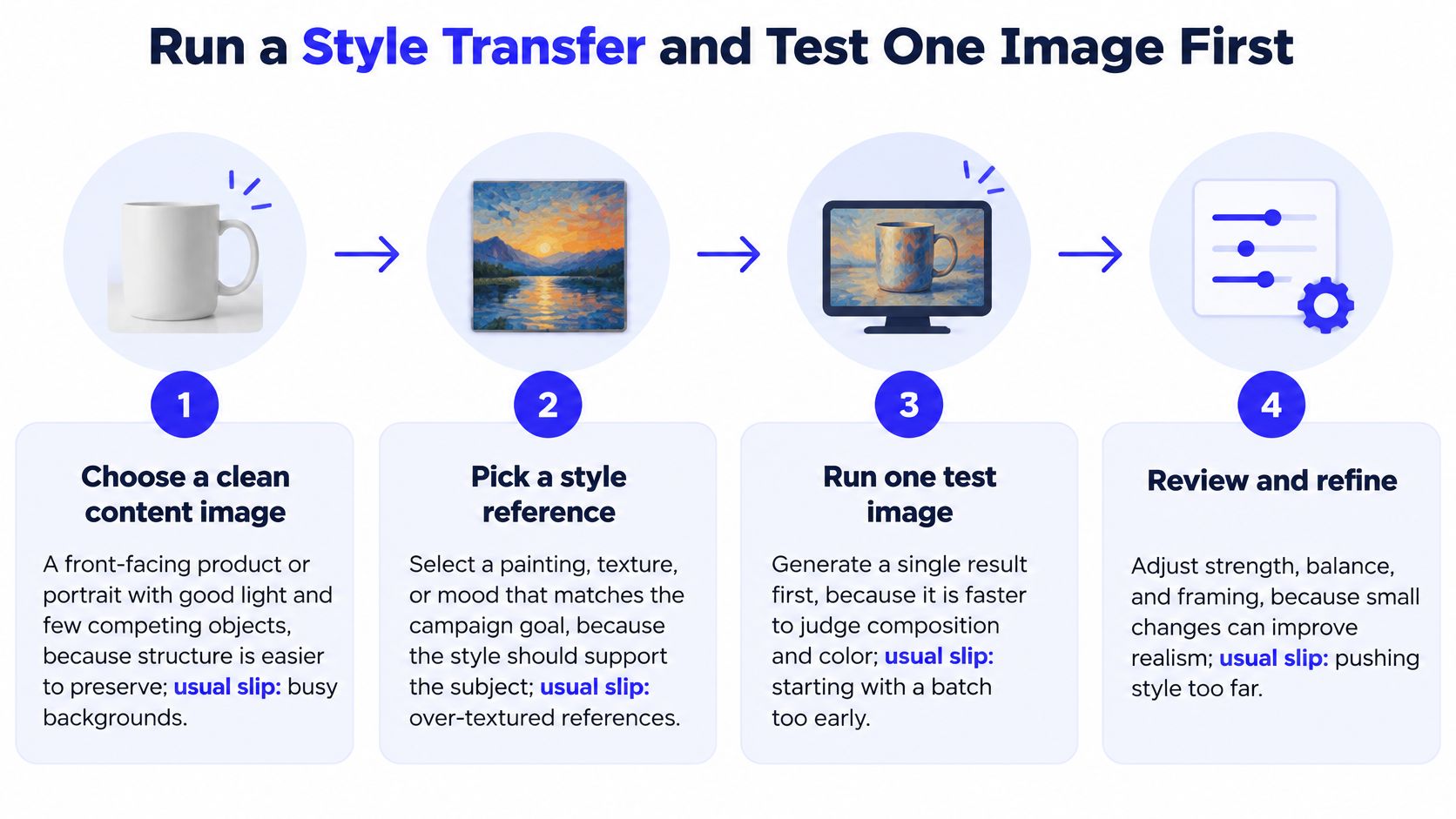
- Choose a clean content image. Pick a front-facing product or portrait with even light and few competing objects, because broad structure holds more easily than fine edges. The usual slip is a busy shelf or a cropped label.
- Pick one style reference and keep it. Use a painting, texture, or palette with clear brushwork or a consistent color organization, since a mid-batch swap makes the campaign look like three brands. The usual slip is an over-textured reference that fights the product.
- Upload both and say what the style is. In an image-to-image tool, load the source and the style reference, then state the attributes in the prompt. Image to Image sits alongside the other image tools in the same account, including generation, editing, background removal, clothes and pose changes, and virtual staging. The usual slip is uploading only the product and hoping the prompt invents the reference.
- Generate three strengths. Run low, medium, and high so the trade-off is visible instead of theoretical. The usual slip is generating ten random looks and calling the prettiest one approved.
- Inspect at full size. Logos, labels, faces, hands, and straight edges show drift first. A thumbnail hides warped type. The usual slip is approving from the grid view.
- Keep the recognizable version. If the subject is still the same object, save it. If none of the three is, lower the strength rather than prompting harder. The usual slip is "fixing" a broken label by adding more style words.
- Test a short batch only after that. Apply the approved reference and strength to about ten source images, then compare the set for consistency. The usual slip is styling two hundred files before you've seen ten.
- Save the recipe with the file. Keep the source, the reference and its permissions, the strength, the prompt, and the output name together so you can reproduce the look next week. The usual slip is a pretty PNG with no record of how it was made.
Directories such as AI image conversion tool listings are useful when you're comparing interfaces, not when you're trying to skip the single-image test. A free allotment of 15 credits covers that first test on one image before you spend more on a batch.
Publish only the outputs that pass identity, legibility, and provenance. Keep the rest as internal tests.
Quality Checks Before You Publish
A styled image that looks painterly in the grid can still fail as a product shot. One score will not catch that, because pixel similarity, perceptual content preservation, and style resemblance each measure a different job. Treat evaluation the way a printer treats a preflight check: every item gets inspected on its own, and one failed item grounds the whole run.
In a text-effect benchmark, TET-GAN+ reached a human score of 3.90/5 against AdaIN at 1.92/5, while PSNR sat at 18.724 versus 13.443, according to the text-effect transfer evaluation. Gaps that size are why a metric panel beats a single number. Pair a content-distance measure such as LPIPS or a VGG-based distance with a separate style-distance measure, then have a person inspect the full-size file. Automatic scores often disagree with what people prefer, so the final call stays human.
Score four things, not one
Build a fixed evaluation set and reuse it: a portrait, a product, a text-heavy label, and a complex background. Every batch then hits the same hard cases, and a setting that breaks text gets caught before it reaches a feed.
Score each output on its own for style strength, object identity, text legibility, and artifact rate. The subject is the fixed control in this setup: only the surface may change while the object stays the same. A strong texture score does not excuse a garbled logo.
| Symptom | Where to inspect | Likely cause | Fix |
|---|---|---|---|
| Warped edges on packaging | Straight edges at full size | High style strength on a structured product | Lower strength or simplify the reference |
| Garbled logo or label text | Text and logo areas | Style pass rewrote fine detail | Re-run at lower strength or keep the text area unstyled |
| Face shifts across a batch | Faces at full size | Uneven application across regions | Pick the best candidate per face or reduce strength |
| Texture on one part only | Semantic regions such as sky, product and background | Reference with uneven texture | Choose a reference with uniform texture |
The routine is short: check the four scores, then inspect the hard regions from the table at full size. Each output gets one of three verdicts: publish it, lower the strength and re-run, or simplify the reference. Averaging a pretty background against a broken label is how bad files ship.
If a passing still is headed for a Reel or story, the export step can reintroduce blur and banding, so follow practical video export tips from LesFM before upload. Any image that fails the four-score check or shows damage in the hard regions goes back for another run at lower strength or gets pulled from the post. Regenerating a failure costs less than unpublishing one.
Creative Uses for Reels, Ads and Product Demos
Styled stills earn their place when one approved reference carries a campaign across different sources. A new filter on every post doesn't do that.
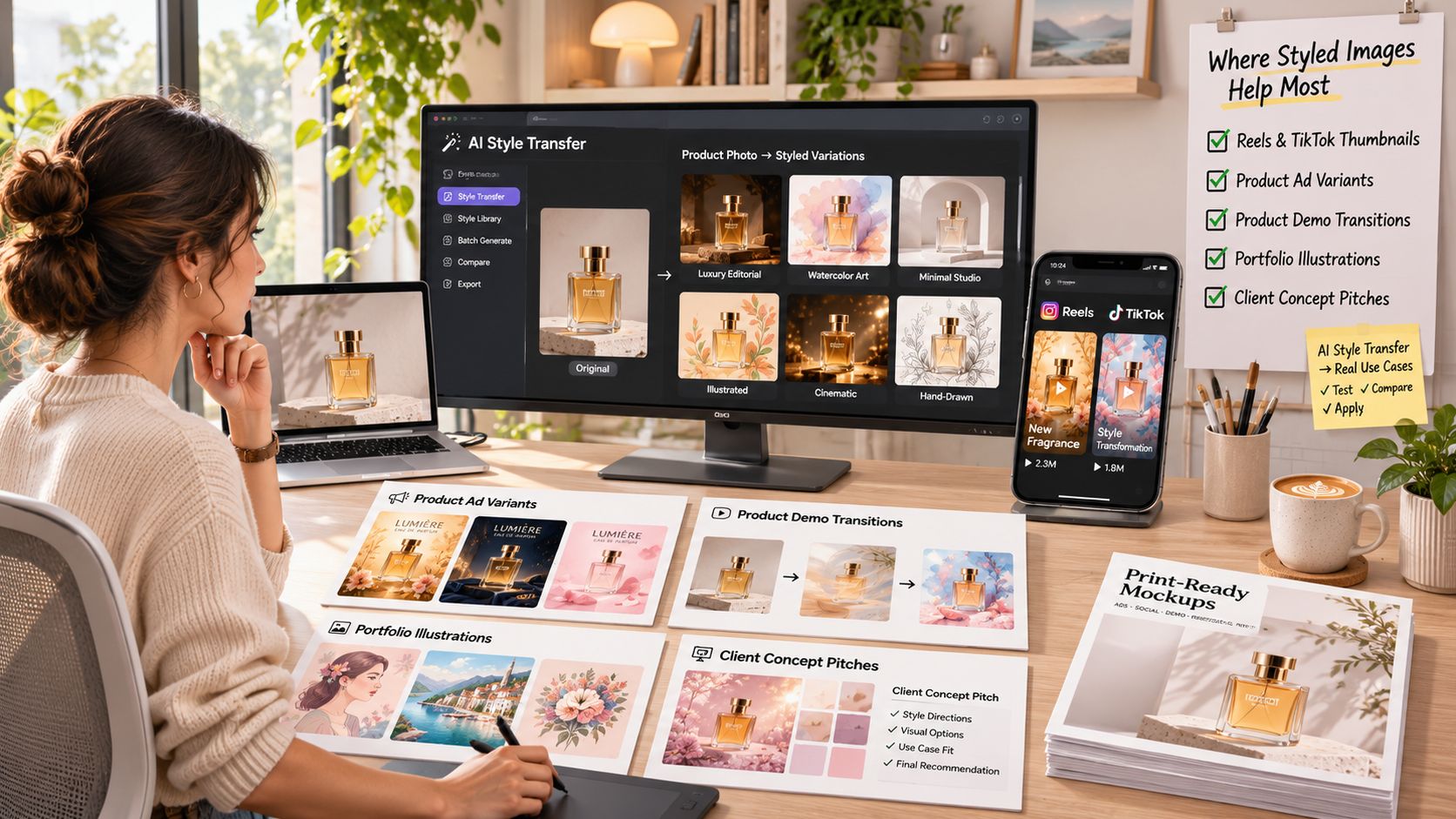
| Use case | Source image | Style reference | Check before posting |
|---|---|---|---|
| Reels or TikTok thumbnails | A tight, well-lit still of the face or product | One consistent palette or texture across the series | Face stays recognizable at phone size |
| Product ad variants | High-contrast product on a plain background | Muted color reference matching brand colors | Logo and label text stay legible |
| Product demo transition | Start frame and end frame of the same product | Same reference applied to both frames | Product shape holds across the transition |
| Portfolio illustration | Own sketch or photo | Reference you own or have rights to | Provenance notes saved with the file |
| Client concept pitch | Brief images from the client | Approved style board | Client confirms the look is their brand, not a copied artist |
In 2025, 86% of surveyed content creators across eight major markets reported actively using creative generative AI, according to Adobe's global Creators' Toolkit Report. The open question is no longer whether a team will try a styled frame. It's which check stops a bad one from shipping. Campaign examples in AI advertising are easier to judge once you know the source, the reference, and the failure you're hunting.
Where structured products break
Conventional style transfer is comfortable on paintings and much less comfortable on exact edges, packaging type, and product geometry. A logo needs a moderate, simple treatment. If the cap oval turns into a brush scribble, the ad has failed even when the texture looks expensive.
A demo that has to move between two states is a different job from a thumbnail. Start-End Frame takes an uploaded start frame and end frame and generates the transition between them. Style both frames with the same reference first, or the bottle will change costume halfway through the reveal. Say a cleanser goes from closed cap to open pump. Match the palette on both stills, confirm the bottle outline, then generate the in-between.
Reference mode accepts up to 7 uploaded images of people, products, or places and combines them into one scene. That helps when a styled product has to sit with a model or a location. More references make each element harder to keep stable, so add them one at a time and recheck faces and labels.
A short walkthrough of the same idea, separating a subject from a look, is worth watching before you style a whole ad set.
Using Artist Styles Without Crossing the Line
Naming a style feels harmless, and a caption seems like it should settle whatever follows. Neither holds up. Three different acts hide inside the phrase "in the style of," and only one of them is a safe default for commercial work.
Style inspiration borrows a broad historical movement. Poster lithography, gouache illustration, late-1800s print lighting: none of these carries a living person's signature. Imitation targets one living artist's recognizable look, whether you name them outright or stack their distinctive traits until the source is obvious. Impersonation goes a step further and presents the output as that artist's own work. Audiences, clients, and the artists themselves judge the second and third acts, regardless of what you intended.
The risk is not hypothetical. An ICLR 2025 study found that, under simple prompting, 20% of 372 prolific artists appeared vulnerable to style copying, and generated images matched the targeted artist more closely than 372 alternatives 70.34% of the time. A disclaimer on the post does not remove the consent or reputation problem. If the picture reads as one person's work, the caption cannot unmake that.
A check before you generate
Three questions decide whether the prompt ships or gets rewritten.
- Does the prompt name a living artist? Delete the name. A movement or a medium is not the same thing.
- Does it combine distinctive traits from one creator? If the only way to describe the look is "like that one illustrator," you are imitating, not describing.
- Do you own or have rights to each reference image? A screenshot from someone's portfolio is not a style board you can ship.
The safer prompt names color, composition, medium, lighting, era, and technique. "Warm gouache palette, flat composition, late-1800s poster lighting" describes a look you can defend. "Make it look like [living illustrator]" describes a person you cannot.
Run the same judgment on the output before it goes anywhere. Hold the generated image next to the artist's actual work. If a stranger could name the source, the answer is fix or discard, not publish with a footnote.
Visual similarity is not proof of authorship, and AI detectors are imperfect, so disclose AI use whenever a viewer could reasonably believe a person painted the image or that a named artist made it. Anonymized prompt data may be used for training and improving ImagesArt AI's systems, so keep confidential client briefs, unreleased products, and private strategy out of the prompt box.
ImagesArt AI is where you can restyle a product still with a movement-level prompt, then carry the approved look into a short clip with image-to-video, Start-End Frame, or up to seven references. Start with one clean test, keep the version that still looks like your product, and try the workflow on ImagesArt AI.