Add Frame Photo: A Step-by-Step Border Guide
ImagesArt.ai
11/20/2026
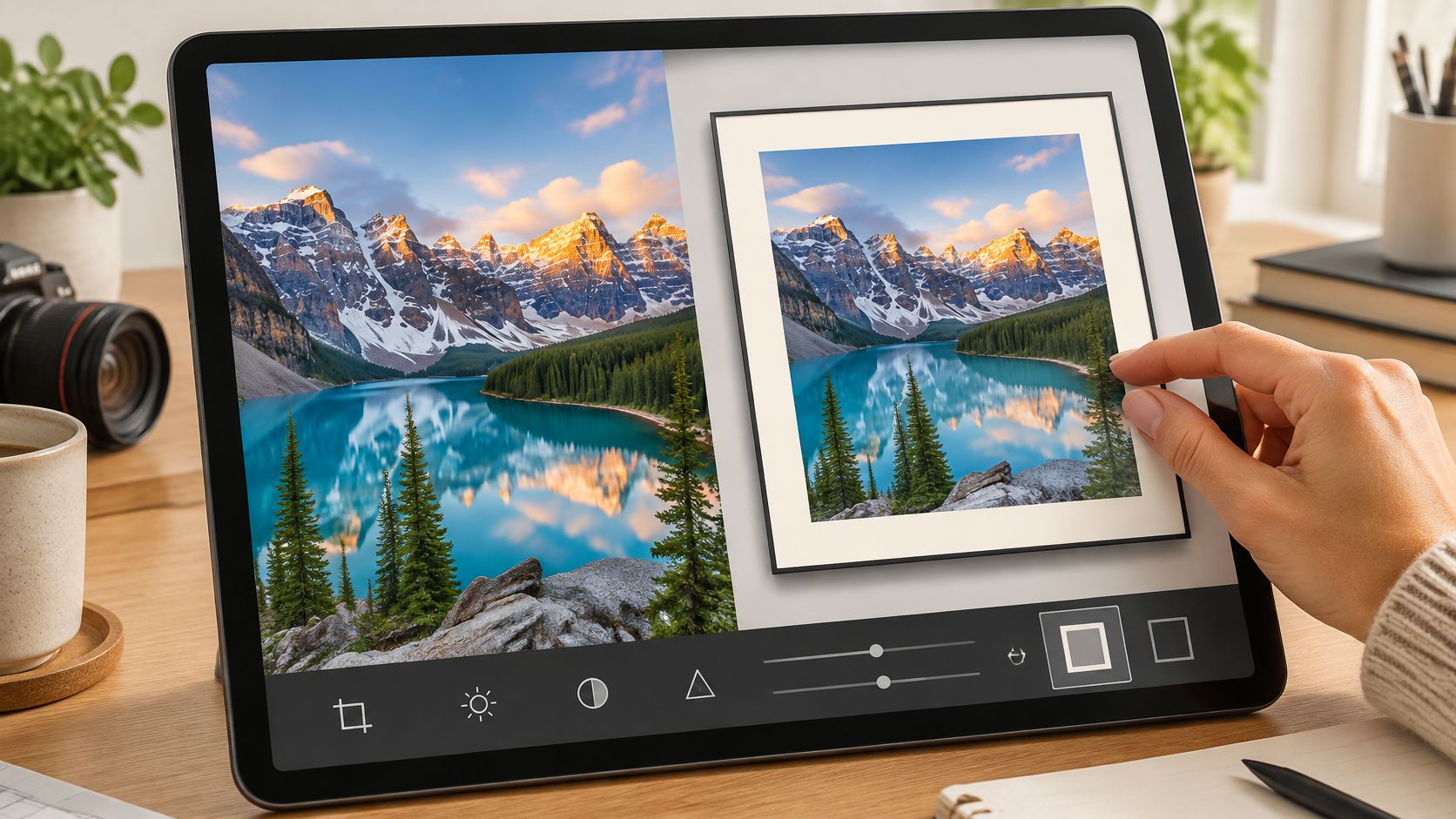
You've got a folder of product shots, a portrait session, or a stack of travel photos, and the job blocking you isn't the edit. It's the posting. The images need a border so they hold together in a grid, so a caption has somewhere to sit, so a client's logo doesn't collide with the edge of the picture.
So you add one in a phone app, publish it, and pull it up on your own feed. The 2-pixel mat line has vanished. The shadow has turned into a gray smear across the bottom of the picture. A border that looked generous on a 27-inch monitor now reads as a thin wobble of color on a 6-inch screen.
Framing a photo isn't a filter. It's a layout decision made of layers, percentages and an export step, and it's worth doing the way a designer does it: border on its own layer, verified at phone size, exported once per destination, then reused as the opening keyframe when the same still has to move.
Table of Contents
- Pick a Frame Style and Size Before You Edit
- Frame Settings for Thickness, Mat and Shadow
- How to Add a Border Frame Step by Step
- Export Sizes for Social, Web and Print
- Fix Halos, Cropped Subjects and Muddy Edges
- Use the Framed Photo as a Video Keyframe
Pick a Frame Style and Size Before You Edit
Start with what the photo has to do, not with the editor you happen to have open. A grid post that sits between two others needs different edges than a print that hangs behind glass, and a border that flatters a pale travel shot can flatten a dark product photo. Five styles cover most of what creators and small teams need.
| Frame style | How to build it | Best for | Setup time |
|---|---|---|---|
| Solid border | Add canvas padding and fill with one color | Social posts and quick shares | About 2 minutes |
| Inner mat | Thin inner line plus a wider outer border | Portraits and gallery-style prints | About 5 minutes |
| Polaroid style | Extra bottom margin in white or cream | Travel and nostalgic posts | About 5 minutes |
| Drop shadow frame | Border plus a soft shadow layer below the photo | Product shots and web cards | 5 to 10 minutes |
| Transparent PNG overlay | Place a saved frame PNG over the photo | Repeating branded templates | About 3 minutes after saving |
Three rules settle the choice faster than any preview. Busy edges take a solid border, because branches, loose hair or cluttered packaging leave the eye nowhere to rest and a mat just adds another line. Portraits and anything headed for print get an inner mat, since the thin band separates a face from a colored outer edge and survives being printed, where a flat border can look unfinished. Save a PNG overlay only for repeats: if the same branded frame goes out weekly, build it once with a transparent center, but for one-off posts the setup costs more than it saves.
Before any of that, check where the subject sits. A border adds space around the picture; it can't put back a shoulder or a product corner you already cropped off. If a face is touching the top edge, fix the crop first, then frame it.
Print sizes change the decision too, because a border eats into the paper. This guide to choosing the right poster frame size walks through the ratio math before you commit to a 3:4 for a wall piece.
Then commit in writing: the style and the destination, note, feed, story or print. Every setting further down this workflow depends on that line.
Frame Settings for Thickness, Mat and Shadow
Border width changes a framed photo more than any other control. Set it as a percentage of the shorter edge rather than a fixed pixel count, so the same recipe works on a 1080-pixel story and a 4000-pixel print master. Start at 4% of the shorter edge and test between 3% and 8%. Thin borders read modern and let the picture carry the frame; thick borders read like a gallery print and buy room for a caption.
| Setting | Starting value | Range to test | Effect |
|---|---|---|---|
| Border width | 4% of shorter edge | 3% to 8% | Thin reads modern, thick reads gallery |
| Inner mat width | 2% of shorter edge | 1% to 3% | Separates the photo from a colored outer border |
| Corner radius | 0 px | 0 to 12 px | Rounded corners suit app-style posts |
| Shadow opacity | 25% | 15% to 35% | Lifts the photo off a light background |
| Shadow offset | 10 px down | 5 to 15 px | Larger offset looks more like a physical print |
The stack matters more than the numbers. Here is the arrangement that keeps every control editable a week later:
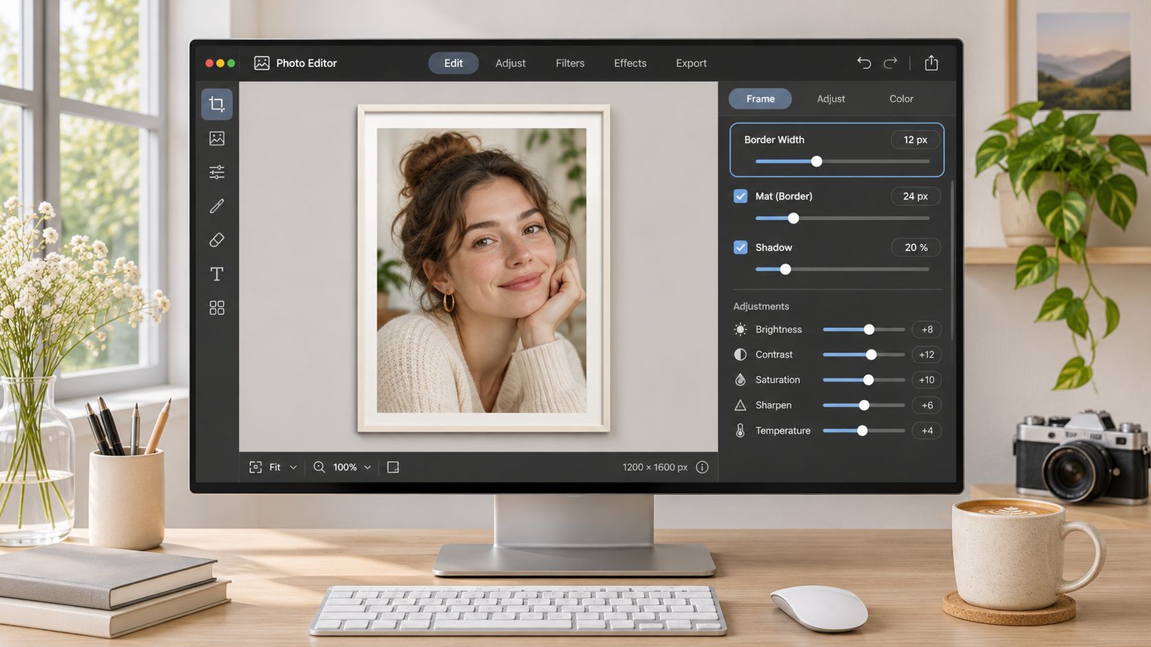
Keep frame, mat, shadow and background as separate layers above the untouched photo. Build the frame as an outer canvas with an inner aperture, and preserve the photo's aspect ratio with contain or crop fit so the image never gets resampled or clipped. With each element on its own layer, you export a flattened preview for delivery while the project file stays editable, and the same still can serve as a start or end keyframe for a short video later without cropping the subject. Physical framing follows the same separation logic: the Canadian Conservation Institute framing note states that glazing must stay separated from the image by a mat or spacer, and that standard glass gives no reliable UV protection. If the file gets printed and hung, keep the mat.
Run the safe-area pass at phone size before you render. Zoom the canvas to actual story dimensions, or send a preview to your phone and look at it at arm's length. No face, hand or product edge should touch the inner aperture, and the frame needs enough contrast to read on a small screen. A charcoal frame around a pale photo works; a mid-gray frame around a gray studio backdrop disappears.
Shadows deserve one line of caution. A wide blur at low opacity on a dark background turns muddy, so keep the blur tight and lift opacity in small steps. Then save the finished values as a preset, because the second photo in a series has to match the first.
When a design is headed for a physical frame, the same decisions come back in wood and card. Browsing a frame guide at Bridle Up Hope Shop gives a feel for how molding color and mat width combine in a finished piece, so settle those choices on screen before you order materials.
How to Add a Border Frame Step by Step
Work in a layered editor such as Photoshop, Affinity Photo, GIMP or Photopea. The five moves below cover the whole job, and the numbered steps add the detail behind each one.
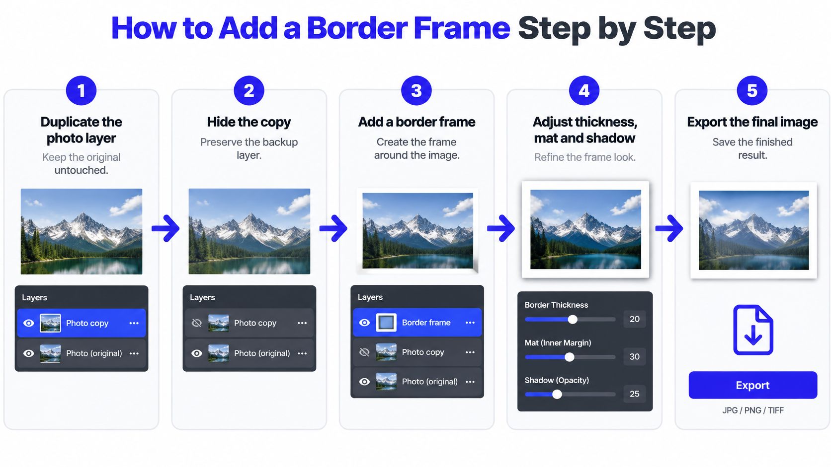
- Duplicate the photo layer and hide the copy. You keep an untouched original inside the same file, so a bad pad or an accidental flatten costs you nothing. Hidden layers don't export.
- Pad the canvas by a percentage of the shorter edge. Use Canvas Size and add equal amounts to all four sides, 4% per side as a starting point. Percentages mean the recipe scales from a phone snap to a print master without recalculating, and the photo never gets resampled.
- Add a fill layer beneath the photo and sample the color. Pick the darkest tone in the image for a border that feels native to the shot, then move the fill below the photo layer. A fill applied above the photo will cover it completely.
- Draw the inner mat as a thin stroke outside the photo edge. Use off-white or a light tone pulled from the highlights, 1% to 3% of the shorter edge. Draw it as a shape or a layer style rather than painting it, so it stays perfectly even on all sides.
- Build the shadow from a duplicate, not a filter panel. Duplicate the photo layer, fill it black, apply a small Gaussian blur, drop opacity to roughly 25% and drag it below the photo. A shadow sitting above the photo makes the picture look pasted onto the background.
- Check the result at phone size. Zoom to fit at roughly 30% or export a fast JPEG and open it on your actual phone. Thin mat lines and low-contrast borders fail here first, and that's the whole point of checking.
- Export a flattened copy and keep the layered file as the master. Name the master by subject and date, so the version you re-export for print in six months is obviously the source.
Watching the canvas-padding move once beats reading it twice, especially if your editor's Canvas Size dialog hides the anchor grid.
Where framed batches go wrong
One-sided padding is the mistake that ruins more batches than any other. The canvas grows only at the bottom or the right, the photo drifts off-center, and the margins no longer match across the set. Select the whole canvas and turn on rulers or guides before you export; even margins on all four sides are what make a group of framed images look like a series.
The second failure is fitting a photo to a fixed aperture by scaling it down, which can crop a hand or a product label. Change the padding instead of the photo.
A frame is a decision you make once and apply many times. If the tenth image in a series needs different values from the first, the preset was wrong, not the image.
If you'd rather work in a browser than a desktop app, this guide to adding a frame to a photo covers the same moves in a web tool, including where the layer stack gets simplified.
Export Sizes for Social, Web and Print
Every framed photo should produce two files: a compressed copy for posting and a lossless master for print and archive. Decide both before the border goes on, because the frame changes the final dimensions and it's easy to frame the same picture twice for two different sizes.
| Destination | Size | Format | Check before upload |
|---|---|---|---|
| Instagram feed, portrait | 1080 x 1350 px | JPEG, sRGB | Frame stays inside the 4:5 view |
| Stories and Reels, vertical | 1080 x 1920 px | JPEG for images, MP4 for video | Border clears the top and bottom interface zones |
| Website or email | 1600 px on the longest edge | WebP or JPEG at 80 to 85% quality | Frame edges stay sharp at reduced size |
| Print master | Final inches x 300 ppi | TIFF or PNG, lossless | Dimensions match the mat opening |
| Square feed post | 1080 x 1080 px | JPEG | Even margins and the subject fully inside the frame |
For print, do the arithmetic in inches: a 12 by 16 inch framed piece at 300 pixels per inch needs 3600 by 4800 pixels before the border is added, not after. That number is the reason to keep the layered master around. If the print is going behind glass, the Library of Congress preservation service advises that materials contacting the photograph pass the Photographic Activity Test (PAT, ISO 18916), notes that glass or acrylic touching the image can cause abrasion, sticking or mold, and points to a 100% cotton-rag mat with roughly 1/16 to 1/8 inch of fitting clearance. Size the master to the mat opening and leave the border inside that measurement.
Keep the creator, caption and copyright fields intact when you hand off the flattened file. The IPTC photo metadata timeline records Adobe adding IPTC headers to Photoshop during 1994 and 1995, and those fields still travel inside a JPEG long after it leaves your drive.
Vertical placements have their own geometry, and Pinterest is the strictest of them. This pin size guide for eCommerce sellers covers the tall 2:3 canvas, which is a different crop from the 4:5 feed frame you just built.
Fix Halos, Cropped Subjects and Muddy Edges
A halo or colored fringe around the border is the first thing to inspect after export, because it's the easiest to fix. It means the file went through JPEG compression more than once: the border edge is high contrast, and each save smears the pixels on either side of it. Reopen the layered master, export once, and stop saving over the compressed copy.
The rest are single-setting problems:
- Cropped subject. You scaled the photo down to fit a fixed aperture. Undo it and add canvas padding instead, so the face or product keeps its full shape.
- Frame invisible on a phone. Too thin, or too close in value to the photo. Widen the border by a percentage point and push the fill toward a darker or lighter tone, not a different hue.
- Muddy shadow. Heavy blur at low opacity on a dark background. Cut the blur radius, keep the opacity in the low thirties, and stop the shadow from drifting more than 15 pixels.
- Jagged edges on a cutout. The alpha edge, not the border, is at fault. Run a background removal workflow on the source and frame the clean cutout, because a rough edge gets magnified by a light border.
- Soft or blocky export. The frame was added to an already-compressed file, or the resize happened after the border. Always pad first, resize last.
Practical rule: change one setting, re-export, and compare at phone size. Two changes at once and you won't know which one fixed the edge.
Record the value that worked next to the batch name, then rebuild the rest of the set from the corrected preset rather than patching each file by hand.
Use the Framed Photo as a Video Keyframe
A finished frame is also a ready-made opening shot. When the same still has to appear as a five-second Reel, an ad or a product demo, the bordered photo you just built is your first keyframe, and the work moves to preparing a matching ending and constraining the motion so the border doesn't wobble.
- Choose the ratio before you generate. Adobe's image-to-video workflow guidance recommends settling on 9:16 for Reels, Shorts and TikTok, 16:9 for YouTube and 1:1 for square placements, and notes that a clear, well-lit source at 1080p or higher helps motion prediction.
- Keep the subject and the frame inside the central safe area. Platform overlays and a later crop both attack the edges, so place the product, face and any headline in the middle third and let the border sit inside those lines too.
- Prepare an ending photo that matches. Shoot or select a second image of the same subject in its end state, an opened package or a staged room, with the same placement, lighting and camera angle. Big differences turn a clean reveal into an unintended morph.
- Upload both frames. ImagesArt AI's Start-End Frame mode takes the framed still as the opening frame and the second image as the ending, then generates the transition between them. Its Reference mode accepts up to 7 images of a person, product or place to keep a subject consistent across takes, and new accounts get 15 free credits, enough for one 5-second 480p test clip before you commit to a hero render.
- Write the camera move in one line. Slow push-in, frame held still, no zoom on the border, product centered. Tempo words like slow or punch-in control more of the result than most prompts people write.
- Export to the platform's limits. Instagram's Graph API media reference specifies MOV or MP4, H.264 or HEVC, 23 to 60 frames per second, a maximum horizontal resolution of 1920 pixels, a published length from 3 seconds to 15 minutes, and API uploads up to 8 MB, with 9:16 recommended to reduce cropping.
Length matters as much as ratio. Short-form under 60 seconds is the format social users interact with most on Facebook, at 48% according to HubSpot's marketing statistics, which is a good reason to keep the first variant tight and let the reveal land early.
More motion isn't better. A restrained push-in with the border static reads as a product reveal; a sweeping camera move reads as an accident.
If you're new to the motion side, this walkthrough on how to animate a photo covers the prompt structure and the checks that keep a face or a logo from deforming between frames.
ImagesArt AI gives you a place to turn that framed still into a clip: Start-End Frame builds a controlled transition from your opening photo to an end state, Reference mode holds a product consistent across up to 7 images, and new accounts start with 15 free credits for a test render. Bring your bordered master, describe the camera move, and see how it holds at phone size before you spend credits on the full set. Visit ImagesArt AI to try the workflow on one hero shot first.